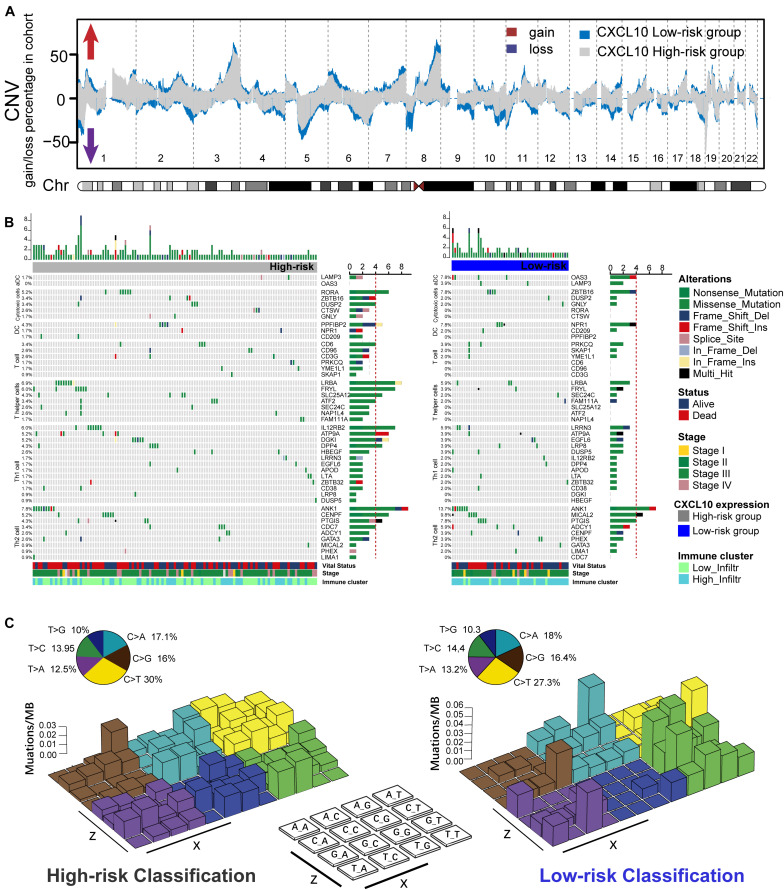
FIGURE 4.
Genetic alteration extracted from the aggregated ovarian cancer samples. (A) The Copy number profiles of high (blue)- and low (gray)-risk classification showed different pattern of gains and losses. Frequency of copy number alterations were plotted on Y-axis, and corresponding chromosome was plotted on X-axis (chr 1–22). (B) Mutational landscape of specific immune-cell genetic alterations in high-risk classification (left) and low risk classification (right). The middle panel depicted 45 valid signature genes alteration across analyzed TCGA dataset, and different alteration types were coded with different color. The number on the right indicated the mutation frequency of each gene. The right panel indicated the proportion of each variant type. Each column represented individual patients, and displayed with survival status, stages, and immune cluster. (C) Legoplot representation of mutation patterns in two classifications. Single-nucleotide substitutions are divided into six categories with 16 surrounding flanking bases (each category represented by a different color). Inset pie showed the proportion of six categories of mutation patterns.

