
Figure 2.
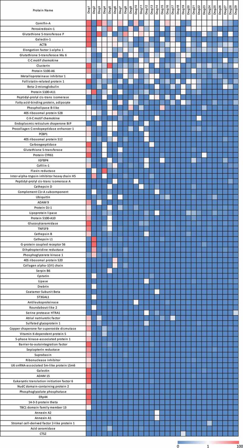
Heatmap of HCP abundance in approved therapeutic proteins. Columns represent a therapeutic protein ordered by decreasing number of HCP identified. Each row is an individual HCP identified in the current analysis. Colors signify HCP abundances ranging from >100 ppm (red) to 0 ppm (not detected, blue)