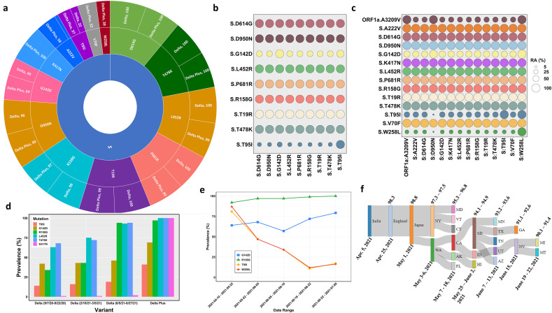
Fig. 1.
Details of genetic variations in Delta and Delta Plus variants. Panel a. A sunburst plot shows the distribution of mutations in Delta variant sequences (n = 676) and Delta Plus variant sequences (n = 520) with greater than 35 % prevalence. All available high coverage, complete sequences of the Delta variant collected during July 6–13, 2021, were downloaded from GISAID [5] and processed through NextClade [15]. The prevalence was computed using an in-house Python script and Pandas library. Panel b. Relative abundance of the Spike mutations with greater than 20 % prevalence in Delta variant. The prevalence was computed using Delta variant sequences (n = 676) using an in-house Python script. Panel c. Relative abundance of the Spike mutations with greater than 20 % prevalence in Delta Plus variant. The prevalence was computed using Delta Plus variant sequences (n = 288) using an in-house Python script. Panel d. Prevalence of five key mutations (T95I, G142D, R158G, L452R, T478K, and K417N) at different time points in Delta variant (n = 600) sequences and Delta Plus variant (n = 200) sequences. The prevalence was calculated and plotted with an R script and ggplot2 library. Panel e. Temporal analysis of Delta plus mutations of interest. Sequences of the Delta Plus variant were sorted by date (n = 520) and grouped in groups of 100 each except the last group that contained 118 sequences. Two sequences were excluded due to poor quality. The date ranges were marked by the first and last sequence collection date. The prevalence was calculated as described above. The data were plotted using the ggplot2 library of R. Panel f. A Sankey diagram showing the dynamics of Delta Plus introduction into the United States. To generate the Sankey diagram, we aligned the first collected and dated Delta Plus sequence from India, England, Japan, and different states of the USA. We then grouped the sequences based upon the date collected and percent homology cut-offs as indicated at the top of the plot and date range shown below the plot.

