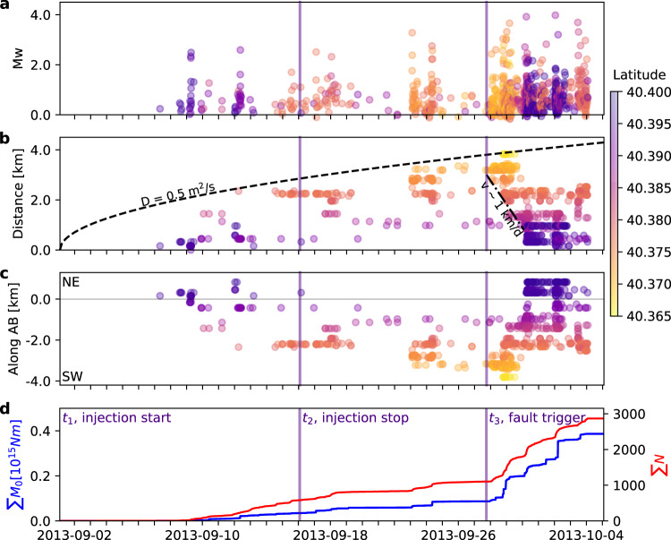
Fig. 7. Timeline of injection and seismicity.
Temporal evolution of a magnitudes, b epicentral distances from the injection well, c epicentral location projections along profile AB, as in Fig. 2, and d cumulative moment release and cumulative number of earthquakes for the time period from 2013-09-02 00:00 until 2013-10-06 00:00 UTC. The onset of three main phases are marked by indigo vertical bars, denoting injection start (t1, 2013-09-02), injection stop (t2, 2013-09-17), and approximate first triggering of the fault hosting largest earthquakes (t3, 2013-09-28, 16:00). The color scale used in a–c refers to event latitudes (top right). A dashed line denotes the diffusion curve from the injection point at time t1, assuming a diffusivity of 0.5 m2/s, which explains the migration of seismicity during phases 1–2, and a dashed-dotted line the faster earthquake triggering backward propagation with a velocity of v ~ 1 km/day during phase 3. Note that plotted seismicity corresponds to 964 events: 51 accurately relocated events (Fig. 2a) and those detected by template matching using the 51 events as templates; we attributed to detected events the same locations as their templates.

