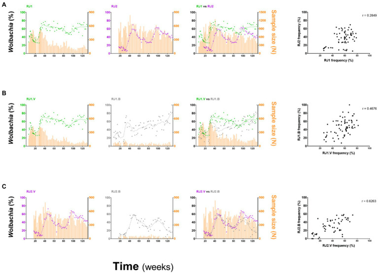
Figure 4.
Comparison of invasion profiles between intervention areas and deployment strategies. wMel frequencies for different intervention areas, or deployment strategies, were represented individually and overlayed and compared by Spearman’s correlation analyses. (A) RJ1 vs. RJ2; (B) RJ1.V vs. RJ1.B; and (C) RJ2.V vs. RJ2.B. The degree of association between frequency datasets is indicated by the r coefficient, at the top right of the correlation graphs.

