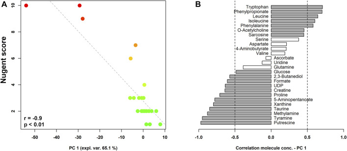
FIGURE 2.
rPCA model built on the centered and scaled concentrations of the metabolites showing significant differences based on Nugent score. In the scoreplot (A), the color of the dots (each representing a woman enrolled in the study) goes from green to red as the Nugent score increases. Y-axis shows Nugent score values. In the barplot (B), describing the correlation between the concentration of each molecule and its importance over PC1, dark grey bars highlight statistically significant correlations (p < 0.05).

