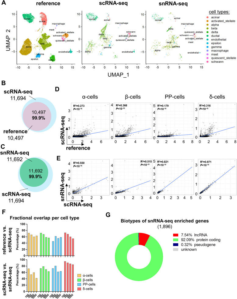
Fig. 3.
Comparison between snRNA-seq and scRNA-seq datasets following harmonization on reference dataset. A Global UMAP plots and cell type prediction in the scRNA-seq (middle panel) and snRNA-seq (right panel) following harmonization on the reference dataset generated by integrating five published scRNA-seq datasets of cultured human islets [21, 23, 26, 27, 57] (left panel). Y-axis is similar in all three panels. B Venn diagram of detected genes in the reference (pink circle) and in our scRNA-seq dataset (blue circle). C Venn diagram of detected genes in our scRNA-seq (blue circle) and in our snRNA-seq dataset (green circle). D, E Scatter plots of harmonized cell type-specific gene expression in α-cells, β-cells, PP-cells, or δ-cells D between the reference and the scRNA-seq datasets and E between the scRNA-seq and the snRNA-seq datasets. X-axis and Y-axis represent the expression levels in natural log of counts in the indicated datasets. The blue line in each plot represents the regression line, whose fit is indicated by the R2 value (the square of the Pearson correlation coefficient). The P and R values are provided for each correlation. F Fractional overlap expressed in percentages (%, Y-axis) of increasing numbers (100, 200, 500, and 1000, X-axis) of top genes within α-cells (yellow bars), β-cells (green bars), PP-cells (blue bars), or δ-cells (red bars) in reference vs. scRNA-seq (upper panel) and in scRNA-seq vs. snRNA-seq (lower panels) datasets following harmonization to the reference. G Pie chart representing proportions of biotypes of genes detected with higher confidence in snRNA-seq compared to scRNA-seq (snRNA-seq enriched genes)

