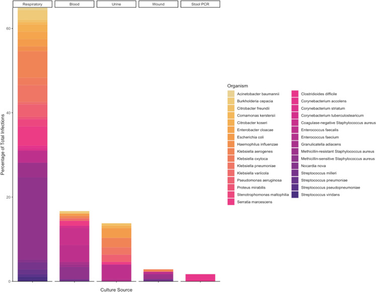
Figure 2.
Bar chart demonstrating each type of infection (x-axis) as a fraction of total infections (y-axis). The different colors in the bar chart are proportional to the bacterial species isolated from each source. Gram-negative bacteria are listed in the left column and are represented in gold tones while gram-positive bacteria are in the right column and are colored in purple tones.

