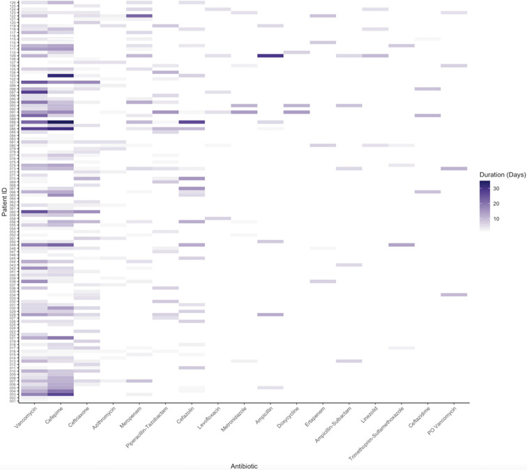
Figure 3.
Heat map showing antibiotic exposures per patient. Each row in the y-axis corresponds to an individual patient, while each column in the x-axis corresponds to the antibiotic listed. The intensity of the coloration is relative to the number of days that a given antibiotic was administered. The antibiotics are listed in order of most frequently administered to least, and only those given to at least 5 patients are included in the figure.

