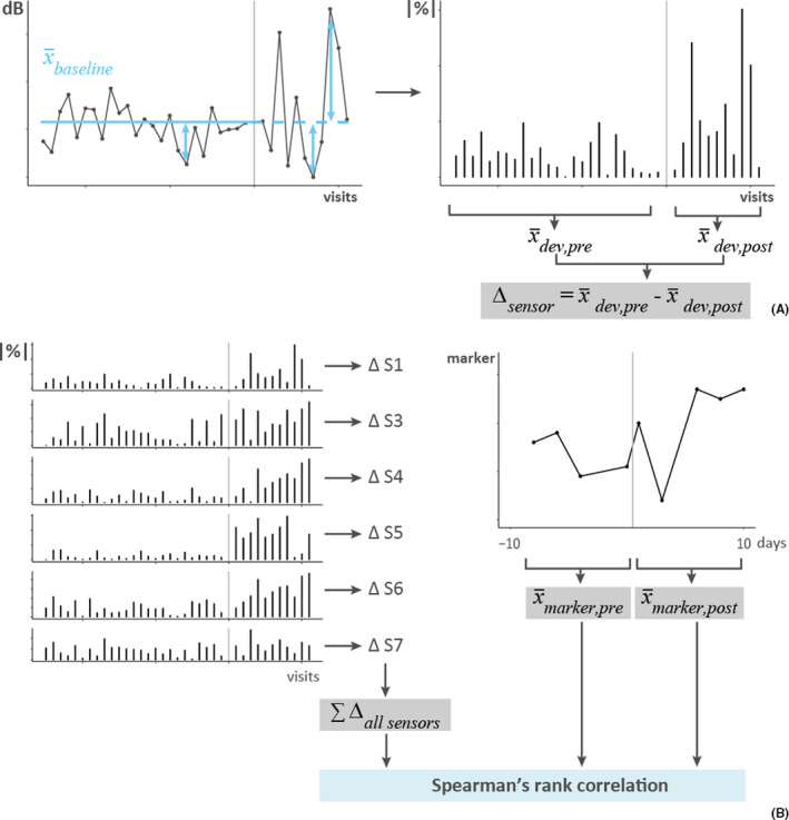
FIGURE 2.

Calculation of eNose deviations. Data from one subject with the vertical gray lines representing the RV challenge. (A) The left graph shows the sensor values (dB) of one sensor, for all visits pre‐ and post‐challenge. The mean of the sensor values pre‐challenge (blue solid line, ) served as the baseline, also for the post‐challenge phase (blue dashed line). Next, deviations from this personal baseline were calculated (blue double arrows) and expressed as absolute percentages (|%|), as shown on the right. Finally, the average deviation pre‐challenge () and post‐challenge () was calculated and the difference () between these, per subject and sensor. (B) The left graph shows the deviations from the personal baseline for all sensors (S1, S3–S7), expressed as absolute percentages (|%|). The difference in deviations () between the pre‐ and post‐challenge phase was calculated for each sensor and summed to determine the total change in deviations (). On the right, data from one of the markers of interest (FeNO, cytokines, and WURSS‐21) are shown, from which 10‐day averages were calculated for the pre‐challenge () and post‐challenge () phase (note that 10 days ≠10 visits). Finally, Spearman's rank correlations were calculated between the total change in deviation and the pre‐ and post‐averages of the marker of interest, separately
