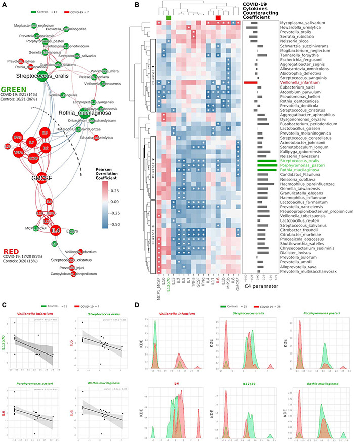
FIGURE 3.

Integration of oral species and cytokines datasets. Network analysis (A) shows communities (namely, GREEN for controls and RED for COVID-19) of bacterial species and cytokines and their positive (red Pearson coefficient) or negative (blue Pearson coefficient) abundances (relative percentage or pg/ml, respectively, for species and cytokines) correlation. Nodes are colored according to the cohort harboring the higher abundance for a definite species or cytokine, and node name size is directly proportional to the “keystonness” (importance of a species or cytokine within the overall network). Edge thickness is inversely proportional to the Pearson p-value after 10% Benjamini–Hochberg two-stages FDR, and it is colored according to positive (red) or negative (blue) Pearson coefficient. For each community are reported percentages of COVID-19- and controls-related nodes. Dashed line represents a “structural gap” (a bunch of negative Pearson correlation edges) between GREEN and RED communities. Correlogram (B) of bacterial species and cytokines shows positive (red) or negative (blue) Pearson correlation on normalized and standardized abundances. Significant correlation is marked with an asterisk inside each square: only species or cytokines having at least one significant correlation were reported. Dendrograms on the x and y axes were generated following Bray–Curtis similarity, evidencing three different clusters for bacterial species (shown here within white boxes). Cytokines chosen to compute the C4 parameter (IL-12p70, IL-6) are highlighted with a colored box in the top dendrogram. The parameter C4 computed for each species is depicted as bar plot length at the right of the correlogram, highlighting the bad species (in red) or the good ones (in green). Scatterplots (C) among the four selected species and the two cytokines used to compute the C4 parameter: their abundances are negatively related to one another (normalized and standardized data), as reported by Pearson coefficient and p-value (95% confidence interval, gray area). Kernel Density Estimation (KDE) plots (D) report on X axis the normalized and standardized abundance of the selected species and cytokines and on Y axis the subjects’ distribution, divided by COVID-19 (red) and controls (green).
