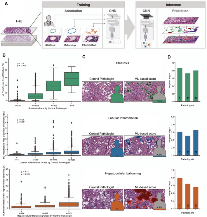
FIG. 1.

ML system for quantification of NAS features. (A) ML process for training and deploying models for the NAS. Example pathologist annotations are shown in the middle panel (bounding boxes). These annotations are used for model training to generate pixel‐resolution heatmaps (left panel), which segment the tissue into corresponding regions. (B) Box‐and‐whisker plots showing comparison of ordinal score based on evaluation by the CP (x‐axis) and ML‐based model measurement (y‐axis). Model values describe the proportion of tissue area predicted to be the substance in question (steatosis, lobular inflammation, or HB). Values shown are Spearman correlation coefficients (rho) and corresponding P values. Boxes show the interquartile range (IQR), and whiskers show 1.5× the limit of the IQR. Points show values beyond this range. (C) Example pathological images (left) and corresponding ML heatmaps (right). Figures represent pathologist label (left) and model predictions (right). Heatmaps represent model predictions: Green regions are predicted to be steatosis (top), blue regions are predicted to be lobular inflammation (middle), and red regions are predicted to be HB (bottom). (D) Intrapathologist reproducibility for scoring of NAS parameters. Values shown are weighted Cohen’s kappa computed for the repeated grading of the same slides (N = 166).
