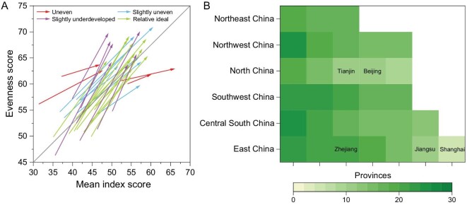
Figure 4.
Developing pathways and effective development scores of 31 provinces from 2000 to 2015. (A) Vector diagram visualizing the developing pathways of 31 provinces (see Methods); (B) effective development scores (EDS) among provinces sorted by geographical locations. The gray diagonal in (A) marks the perfect pathway with a slope of 1, and the colored arrows visualize the pathways among provinces. The color depth in (B) refers to the EDS. The corresponding provinces in (B) refer to Table S4, meanwhile the top five developed provinces are marked accordingly.

