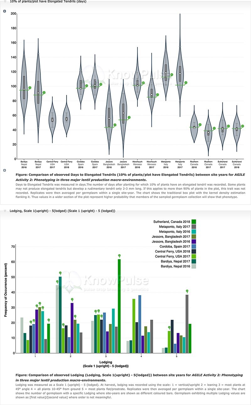
Figure 6.

Phenotypic data visualization on a generic Tripal site. Both visualizations are available on specific germplasm pages and show the distribution of phenotypic data collected separated by site-year with the current germplasm indicated by a green indicator. Violin plots (top panel) are used to visualize quantitative data with the mean value shown on the y-axis and the site-year indicated along the x-axis. Histograms (bottom panel) are used to visualize qualitative data with the frequency of occurrence on the y-axis, the scale shown along the x-axis and each site-year indicated by bar color.
