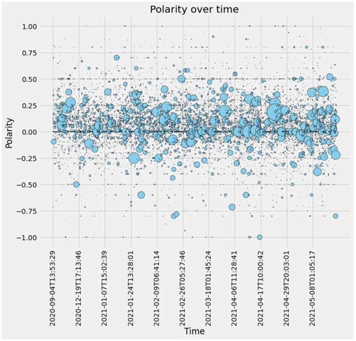
Fig. 1.
Polarity versus time. Polarity is represented on the y-axis and time is represented on the x-axis. Data points are represented as light blue circles. Circle size indicates the number of upvotes per comment. Datapoint sizes are reflective of the vote count and are represented by larger circles and smaller quantities are represented by smaller circles. Please see https://github.com/Cheltone/NLP_Reddit for month-to-month plots.

