
Fig. 3.
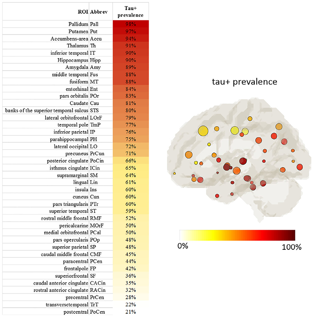
Tau+ prevalence of all ROIs. Left: ROIs sorted according to the Tau+ prevalence. Right: The map of ROIs color-coded by the tau+ prevalence level with circle size denoting the ROI size. Left and right hemispheres demonstrated very similar patterns and were averaged.