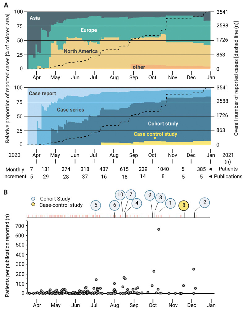
Fig 3.
Comparison of publications on COVID-19 and transplantation over time. (A) The diagram illustrates the course of scientific information about COVID-19 made available (dates of first publication). A distinction is made between the origin of the studies (graph above) the types of publication (graph below). The dashed line represents overall numbers of patients; the colored area represents the relative number of patients reported until that time. (B) The graph depicts the number of patients per publication reported over time. The numbers from 1 to 10 illustrate the 10 studies with the largest patient collective, as presented in Table 2. COVID-19, coronavirus disease 2019.

