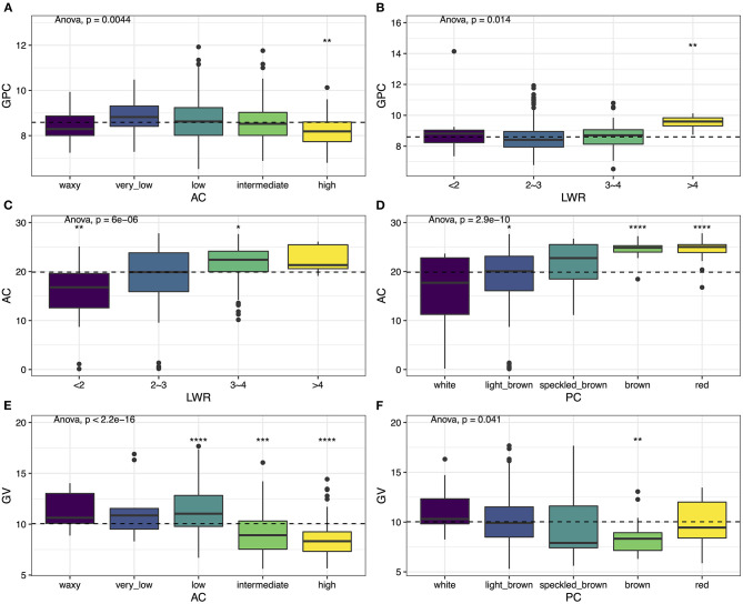
Figure 3.
Phenotypic variation among six traits. (A) GPC vs. AC, (B) GPC vs. LWR, (C) AC vs. LWR, (D) AC vs. PC, (E) GV vs. AC, and (F) GV vs. PC. Box plots show the distribution of the traits in subgroups. Whiskers represent 1.5 times the interquartile of the data. The upper and lower edge of the box presents the interquartile range of the data. The thick black bar in the center represents the median of the data. The one-way ANOVA test is used to determine whether there are any statistically significant differences between the subgroups, and the p-value is shown on the left corner of each figure. The total population acts as a reference group, and each subgroup is compared with the reference group. Different symbols above each subgroup indicate significant differences: *p < 0.05, **p < 0.01, ***p < 0.001, and ****p < 0.0001. The dashed black line represents the mean value of the whole population.

