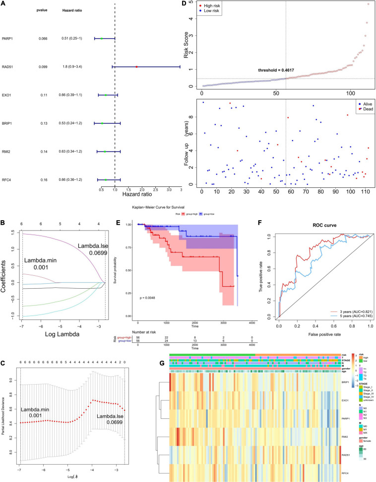
FIGURE 2.
Establishment and evaluation of the prognostic model. (A) The forest plots illustrate univariate Cox analysis of the six genes significantly associated with OS. (B,C) LASSO coefficient profiles of six genes significantly associated with OS. (D) The Risk curve of the risk model. The risk value of patients increases from left to right. According to the median value, the samples were divided into high- and low-risk groups. (E) K–M survival curve of the Risk score. In the figure, the ordinate indicates the survival rate, and the abscissa indicates the total survival time. The red curve represents the high-risk group, and the blue curve represents the low-risk group. The difference between high- and low-risk groups was 0.0048, indicating a significant difference. (F) The ROC curve used to evaluate the effectiveness of the risk model. (G) The top of the heat map shows different clinical characteristics, in which the first line denotes the high-low risk grouping, orange represents the low-risk group samples, and green represents the high-risk group samples. The tree on the left shows the clustering analysis results of different genes from different samples.

