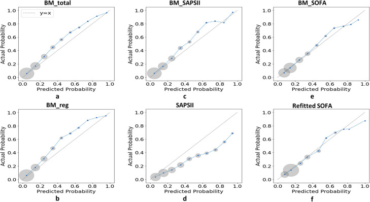
Fig. 3.
Calibration curves for external validation on the test set. For each model, the calibration curve was drew by dividing predicted probabilities into ten subgroups according to deciles of the [0,1] interval and plotting mean predicted probability versus mean actual probability for each subgroup. As shown, each blue point of a calibration curve represented a subgroup and the size of the gray circle around represented sample size of this subgroup. The dotted line was the identity line of y = x representing perfect calibration. The closer a calibration curve was to the identity line, the more similar predicted mortality was to actual mortality, indicating a better calibration of a model. Abbreviations: SAPS II Simplified Acute Physiology Score II, SOFA Sequential Organ Failure Assessment, BM_total blending model based on the total variables, BM_reg blending model based on variables selected by stepwise regression model, BM_SAPSII blending model based on SAPS II related variables, BM_SOFA blending model based on SOFA related variables

