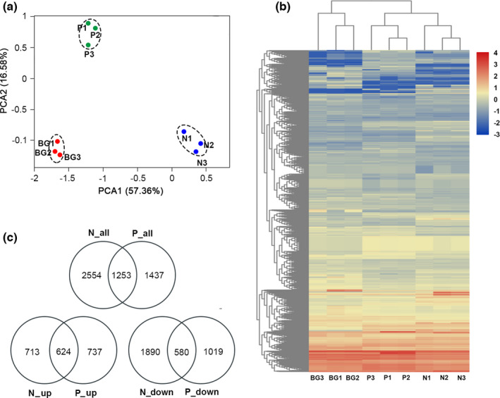
FIGURE 2.

Overview of D. magna transcriptome data and gene distributions in each sample. (a) PCA of the RNA‐seq data. Each dot represents one sample. BG is the normal group (i.e., nutrient sufficient). N stands for N‐limitation, and P stands for P‐limitation (numbers 1, 2, and 3 represent triplicates). Samples near to each other are grouped by dashed circles. (b) Heatmap showing the distribution of unique genes in each sample using normalized depths of genes. (c) Venn diagram showing the DEGs in the comparisons among the three treatments
