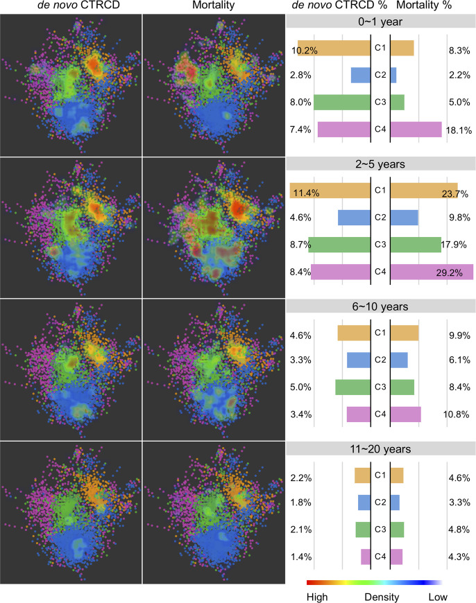
Fig 3. Longitudinal patient–patient network analysis.
The patient–patient network colorized by cluster numbers with red to blue gradual heat map indicating the de novo CTRCD (left) and mortality (right) distribution in the network. A gradient of red to blue color was used to highlight de novo CTRCD and mortality outcomes among the different patient subgroups (whereby dense red saturation means more enriched outcomes for the patients in that area of the network, and more blue saturation low density of outcomes) across 4 different time points. The right bar plot shows the percentage of de novo CTRCD outcome and mortality across 4 subgroups (Fig 2) during 4 consecutive time periods after cancer therapy initiation. Color key for 4 patient subgroups is consistent with Fig 2. CTRCD, cancer therapy–related cardiac dysfunction.

