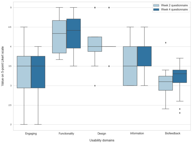
Figure 5.

Boxplot of evaluation questionnaires. Horizontal lines represent medians, upper and lower box limits represent IQR, whiskers represent IQR*1.5, and diamonds represent outliers. Each pair of boxes shows the usability domain score after 2 (light blue) and 4 (dark blue) weeks of use. Note that functionality and design have the highest scores, whereas engagement and biofeedback scores are lower.
