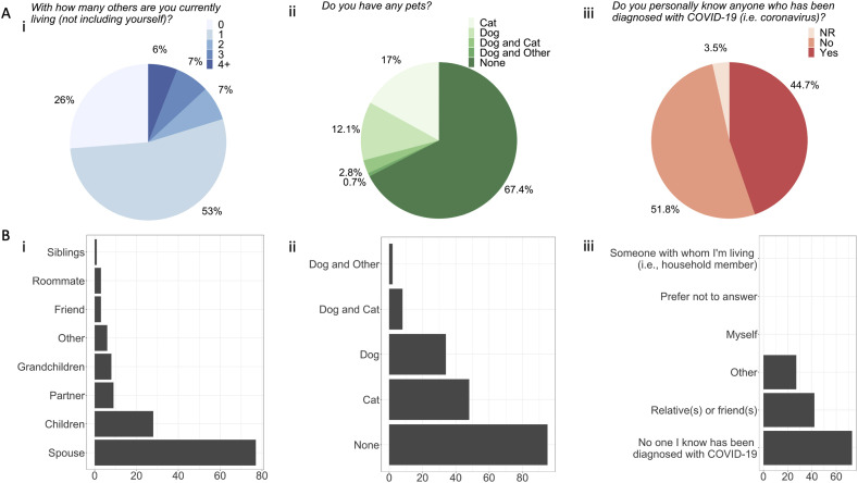
Fig. 2.
Distribution of responses for living situations during COVID-19. The figures demonstrate the Ai) pie chart of percentage of how many people (none to 4+) the participants were living with (not including themselves) and Bi) description of those people (participants were instructed to select all responses that apply). Axis represents number of responses; Aii) the percentage of participants with and without pets and Bii) description of those pets (participants were instructed to select all responses that apply). Axis represents number of responses; Aiii) percentage of people that knew anyone who had been diagnosed with COVID-19 (NR = no response given) and Biii) description of those people (participants were instructed to select all responses that apply). Axis represents number of responses.

