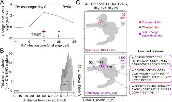
Figure 5. Infected cell phenotypes can be compared to cells taken after infection to reveal regions of expansion.
(A) Fold change in the number of tetramer+ cells (log2) after rhinovirus challenge on day 0. (B) Box and whisker plot show k-nearest neighbors (KNN) regions in terms of expansion during infection represented by percent change as well as percent of tetramer+ cells for post-infection (day 28) and during infection (day 7). (C) Uniform Manifold Approximation (UMAP) plots for 95% change and 5% tetramer cutoffs. Cell count is in black as well as in the upper right of each UMAP plot. Marker Enrichment Modeling (MEM) labels are given for highly expanded and tetramer-enriched regions.

