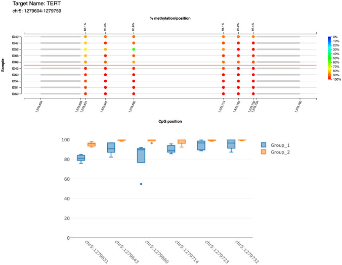
Fig. 1.
The lollipop graph displays the percent methylation per CpG position for 10 randomly selected samples, 5 mhTERThigh cases, and 5 mhTERTlow ones, respectively. The color of the circles represents the percent methylation as shown in the color legend on the right side of the plot. On the lower x-axis, the genomic positions of the CpGs are displayed, the upper x-axis shows the summarized average percent methylation for this CpG position

