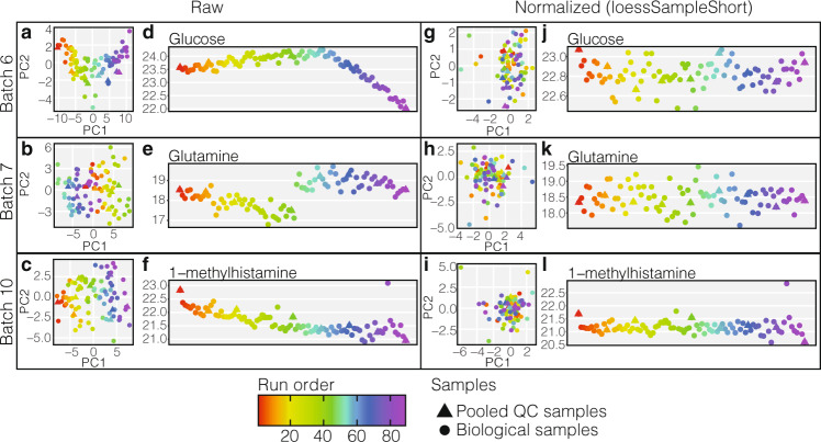
Fig. 2. Examples of typical technical variations and signal drifts within each batch for different metabolites and comparison to normalised data.
(Note vertical scale change.). a–c PCA plots of raw data in batches 6, 7 and 10 respectively, each marker is coloured by the sample run order. d–f Run plots exhibiting metabolite signal drift for glucose, glutamine, and 1-methylhistamine respectively, for their respective batches. g–i PCA plots from the same batches as a–c respectively with intra-batch normalised data using loessSampleShort method. j–l Run plot for the metabolites and batches illustrated in d–f but with intra-batch data normalised using loessSampleShort method. Source data are provided as a Source Data file.

