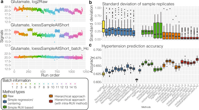
Fig. 3. Key assessments of hRUV performances.
a A run plot of raw, intra-batch-corrected and final hRUV normalised data in all 15 batches of the BioHEART-CT cohort. The x axis indicates the run order, the y axis indicates the signal of glutamate, and samples are coloured by the batch numbers. b Boxplots of all sample replicate (n = 175 sample replicates) standard deviations, where lower values indicate better performance. The boxes are coloured by the approach taken to normalise the data. The y axis of the plot is restricted to a range between 0 to 1 to highlight the differences between the majority of the methods. SERRF and MetNormalizer+SVR’s median sample replicate SD was >1 and thus is not shown. c Boxplots of hypertension prediction accuracies (n = 30 repeats) for all methods. Higher prediction accuracy indicates better performance. The colouring of the boxes are consistent with that in b. In b, c, the box indicates quartiles and the whiskers indicate the rest of the distribution, with outliers shown as dots. Source data are provided as a Source data file.

