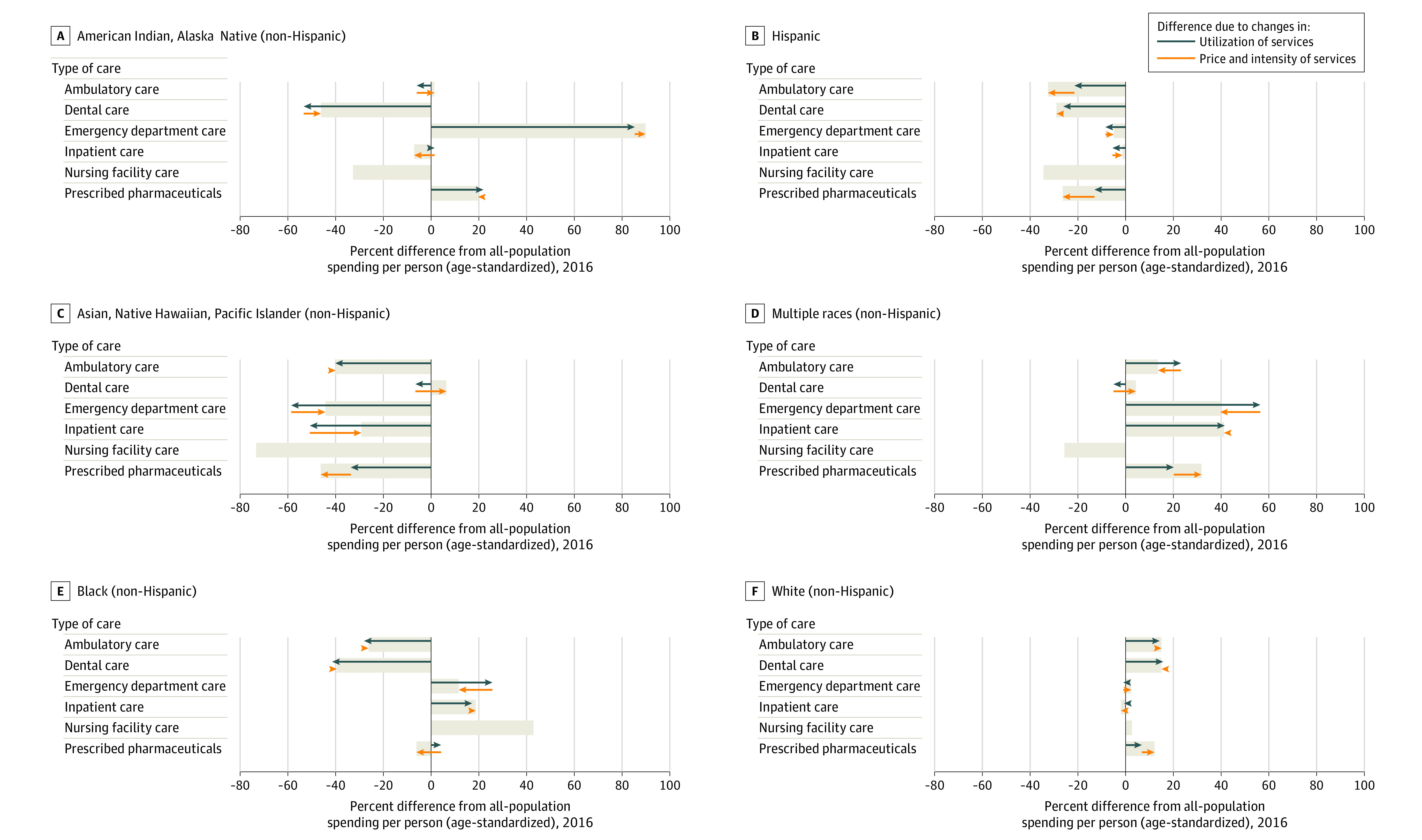
Figure 3. Age-Standardized Spending per Person Attributable to Utilization and Price and Intensity of Services in 2016.

Each bar represents the relative difference in spending for each group, relative to all-population spending for each type of care. Types of care are mutually exclusive. Green arrows indicate the relative differences attributed to differences in utilization, while the orange arrows indicate the relative difference attributed to differences in price and intensity of treatment. Decomposition was not performed for nursing facility care due to the lack of utilization data for this type of care. The corresponding dollar amounts by race and type of care can be found in Figure 2.
