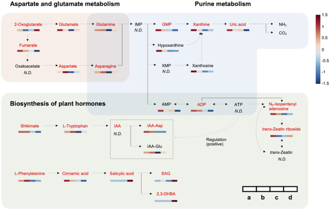
Figure 3.
Metabolic network associated with HLB tolerance based on an integrated pathway. Heat maps show metabolic variations in healthy and infected HLB-tolerant and HLB-sensitive groups [(a) healthy HLB-tolerant group, (b) infected HLB-tolerant group, (c) healthy HLB-sensitive group, and (d) infected HLB-sensitive group]. Metabolites with red color indicate marker compounds (VIP score > 1.0, p-value < 0.05, and |fold change| > 1.5) in the network. The color depth of the heat map represents the degree of metabolic responses as follows: red color denotes increased responses and blue color denotes decreased responses.

