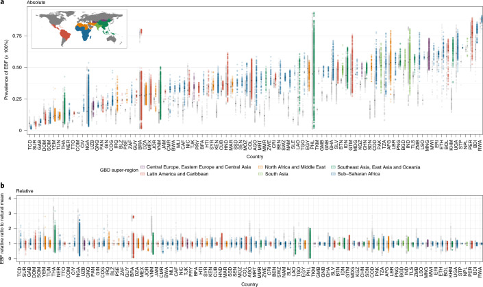
Fig. 2. Geographic inequalities in EBF prevalence across 94 countries for 2000 and 2018.
a, Absolute inequalities: range of EBF estimates in district-level units within 94 LMICs. b, Relative inequalities: range of ratios of EBF estimates in district-level units relative to country means. Each dot represents a district-level unit. The lower bound of each bar represents the district-level unit with the lowest EBF in each country. The upper end of each bar represents the district-level unit with the highest EBF in each country. Thus, each bar represents the extent of geographic inequality in EBF estimated for each country. Bars indicating the range in 2018 are coloured according to their GBD super-region. Grey bars indicate the range in EBF in 2000. The black diamond in each bar represents the median EBF estimated across district-level units in each country and year. A coloured bar that is shorter than its grey counterpart indicates that geographic inequality has narrowed. Countries are labeled by their ISO 3 codes (full country names are listed in Supplementary Table 4).

