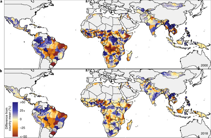
Fig. 3. Relative geographic inequalities within countries in EBF prevalence in 2000 and 2018: comparing district-level units to the country-level means.
a,b, Relative deviation of EBF prevalence in district-level units from the country-level EBF mean in 2000 (a) and 2018 (b). Blue indicates a positive deviation from the EBF country-level mean, indicating a higher EBF prevalence level. Red indicates a negative deviation from the EBF country-level mean, indicating a lower EBF prevalence level. Maps reflect administrative boundaries, land cover, lakes and population; grey-coloured grid cells had fewer than ten people per 1 × 1-km grid cell and were classified as ‘barren or sparsely vegetated’ or were not included in this analysis50–55.

