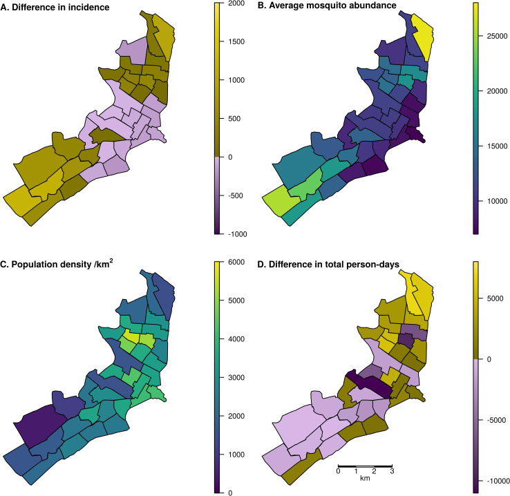
Fig 3. Map of Iquitos, with the 35 Ministry of Health (MoH) zones delineated.
In panels A and D, yellow indicates increases and blue indicates decreases. In panels B and C, colors are a continuous scale showing the given metric. A: Spatial distribution of changes in total incident DENV infections, assigned to the home zone of the infected individual, across a two-year period including the serotype invasion and following seasons. Lockdown was initiated on March 17 in the serotype invasion season. B: Total mosquito abundance across different MoH zones, averaged across the two-year period. C: Human population density of the MoH zones. D: Difference in the total person-days spent in each zone between lockdown and baseline scenarios assuming 70% of people complied with lockdown measures. Shape files for the underlying maps can be found at github.com/scavany/dengue_shelter_in_place.

