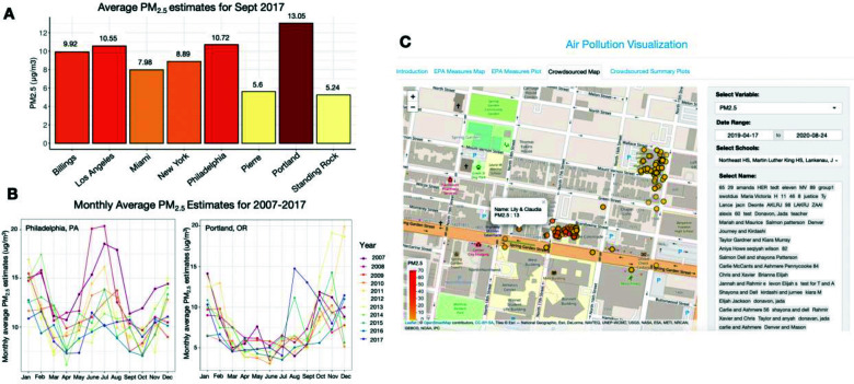
Figure 2.
Features of air pollution visualization app. (A) Bar plot of average EPA AirData PM2.5 estimates for September 2017 in eight U.S. cities. (B) Monthly PM2.5 estimates for Philadelphia, PA and Portland, OR from 2007- 2017. (C) Interactive map of crowdsourced PM2.5 and CO sensor data acquired by students and teachers of six Philadelphia high schools.

