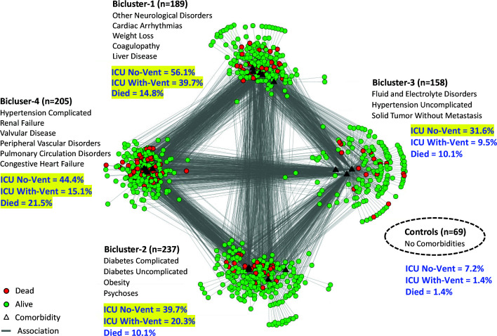
Fig. 3.
Bipartite network visualization with the same 4 biclusters shown in Fig. 2, but showing patients that died (colored red) in each bicluster, in addition to percentages of all three outcomes (shown in blue text) and which of them were significant (highlighted in yellow) compared to the control group.

