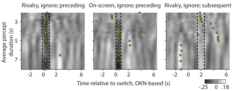
Appendix 1—figure 7. Re-analysis of the significant correlations between pupil response, and preceding (left and center plot) or subsequent (right plot) dominance duration, now separated out as a function of the observer's average percept duration.
Gray values quantify correlations between pupil change rate (z-scored area per second) and preceding or subsequent percept duration (z-scored); correlations that are also shown, but averaged across all observers, in main text Figures 5 and 6. Here the correlations are averaged per groups of five observers, sorted by their average percept duration along the y-axes. Dashed lines delineate the time periods within which the average across all observers is significantly different from zero (periods that are marked by black bars in main text Figures 5 and 6). For each group of five, a yellow disk indicates the middle of the time period at which the five-person average reaches its most extreme value, after smoothing this five-person average by averaging within a sliding window as wide as the interval delineated by the dashed lines.

