. 2021 Aug 20;10:e64731. doi: 10.7554/eLife.64731

Figure 4. Minimal Potts model of ring formation and migration.

(A) Snapshots of a simulated colony of cells showing the formation of highly dense ring of cells. (B) Cell density profiles averaged over all angles for four different times. (C) Corresponding kymograph of cell density (colorbar in cells/mm2) as a function of time and distance to the center. Quantification in terms of microns and hours is described in the Materials and methods section. (D) Kymograph of O2 concentration (colorbar in %) with the position of the ring represented as a red line. The colormap is limited to the 0–10% range for readability but earlier time points show concentrations higher than the 10% limit. (E) O2 concentration at the ring position as a function of time showing that, here too, the ring follows a constant O2 concentration.

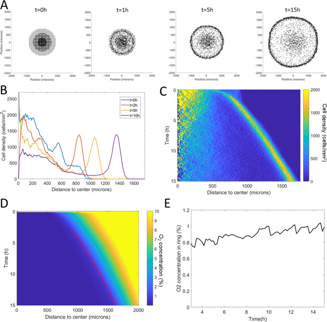
Figure 4—source data 1. Raw data for Figure 4.

Figure 4.

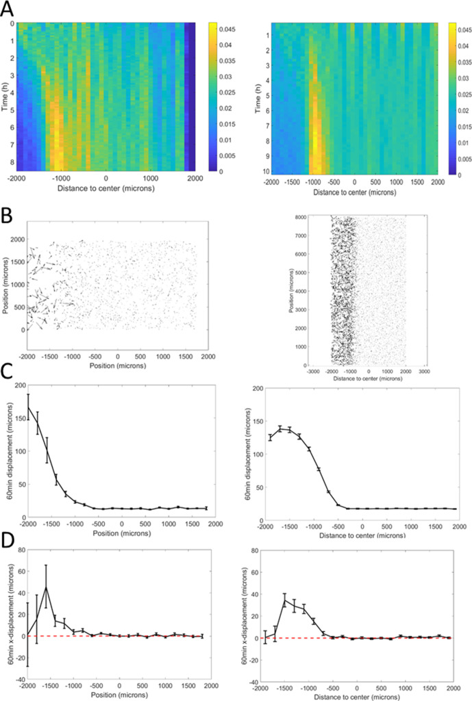
Figure 4—figure supplement 1. Adjusting Potts model (right) to microfluidic experiments (left).

Figure 4—figure supplement 1.

(A) Density kemographs showing cell accumulation in a low oxygen region. Colorbar represents the fraction of all cells within a bin in distance. (B) Vectorial displacements displayed by cells over 1 hr. Higher activity at low oxygen concentrations, on the left, is clearly visible in both cases. (C) Quantification of cell activity as the norm of the displacements over 1 hr at different positions in the central channel. (D) Quantification of cell bias as the displacement of the cells in the x-direction over 1 hr. In C and (D), each point is the mean ± std of cells within the given distance bin, n=3392 cells total for experiments (left) and n=7520 cells total for simulations (right).
Figure 4—figure supplement 1—source data 1. Raw data for Figure 4—figure supplement 1, experiments corresponding to the left column.
Figure 4—figure supplement 1—source data 2. Raw data for Figure 4—figure supplement 1, simulations corresponding to the right column.
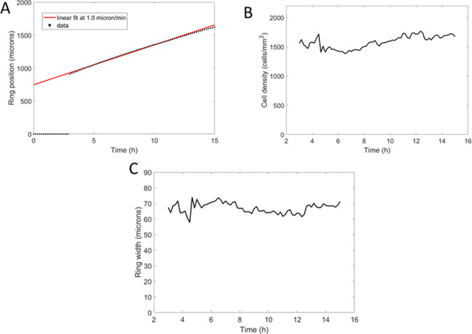
Figure 4—figure supplement 2. Potts model ring features with parameters adjusted from the microfluidic experiments (Figure 4—figure supplement 1).

Figure 4—figure supplement 2.

(A) Position of the ring as a function of time along with a linear fit yielding a speed of 1.1 µm/min. (B) Cell density within the ring as a function of time, after its formation. (C) Width of the ring as a function of time.
Figure 4—figure supplement 2—source data 1. Raw data for Figure 4—figure supplement 2.
Figure 4—figure supplement 3. Comparison of cell behavior in spot experiments (left) and Potts models (right).

Figure 4—figure supplement 3.

(A) Sample vectorial displacements over 1 hr. (B) Cell density profiles at the beginning (black) and end (red) of the time window used for cell tracking. This indicates ring position for other plots. (C) Quantification of cell velocities as a function of position. (D) Mean bias in the radial direction measured as the norm of the projected velocity in that direction. In (C) and (D), each point is the mean±std of cells within the given distance bin, n=4715 cells total for experiments (left) and n=5670 cells total for simulations (right).
Figure 4—figure supplement 3—source data 1. Raw data for Figure 4—figure supplement 3, experiments corresponding to the left column.
Figure 4—figure supplement 3—source data 2. Raw data for Figure 4—figure supplement 3, simulations corresponding to the right column.