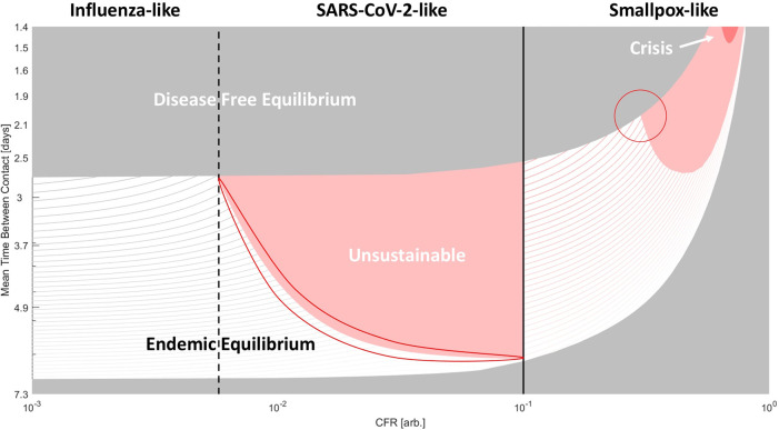
Figure 3. Phase diagram of epidemiological outcomes.
The CFR and the contact rate were varied. For variable recovery rate, see Figure S1. Disease-free equilibrium (gray), endemic equilibrium (striped), unsustainable (red), and host population crisis (loss of 90%, dark red) regions are shown. For CFR > 10%, smallpox-like features are assumed. For CFR<10% SARS-CoV-2/influenza-like features are assumed (these viruses are only distinguished within the model by CFR). Lines within the region bounding endemic equilibrium indicate contours for the percentage of the population infected ( a * + c * )*100. Darker color corresponds to higher values. Two regions subject to kinetic constraints are outlined.

