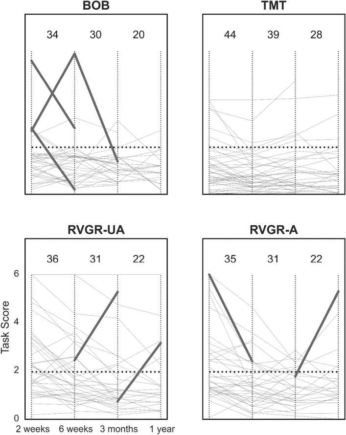
Figure 4.
Line plots of task scores over time in the TIA cohort at all 4 assessments with significant changes corrected for the false discovery rate (FDR). A affected arm, UA unaffected arm. Thin vertical lines demarcate different assessment points for ease of viewing. Horizontal dashed lines represent the threshold for impairment in Task Scores (i.e., > 1.96). Thin grey lines represent each individual’s performance over time. Thick lines indicate significant improvement or deterioration between assessments. Values at the top of each plot indicate the total number of individuals plotted on the relevant interval, e.g., BOB between the first two vertical dashed lines has 34 individuals plotted, one of whom significantly improved, and one of whom significantly deteriorated.

