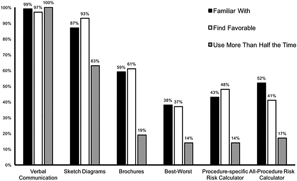
Fig. 1.

Comparative proportion of respondents indicating familiarity, favorability, and utilization. Six queried risk-assessment and counseling strategies are listed along the x-axis of the bar graph. The y-axis represents the proportion of residents in agreement for each question. Familiarity (“Yes,” black), favorability (“Like” or “Strongly Like,” white), and utilization (“Use More than Half the Time” or “Almost always use,” gray) are plotted side by side for comparison.
