. 2021 Aug 24;10:e67308. doi: 10.7554/eLife.67308

Figure 2. Maximum likelihood transmission networks for wards A to D.

Circles represent individuals and arrows show transmission events. White circles represent patients while grey circles represent health care workers. Individuals for which no transmission events were inferred are represented as isolated circles.

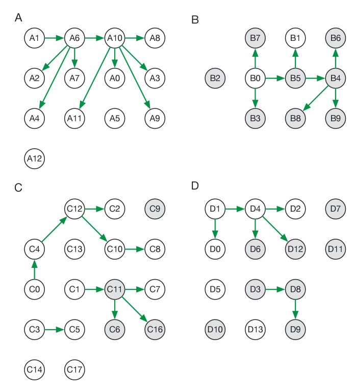
Figure 2.

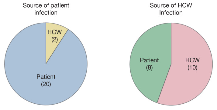
Figure 2—figure supplement 1. Maximum likelihood sources of patient and HCW infections.

Figure 2—figure supplement 1.

Statistics were calculated across maximum likelihood network reconstructions. The great majority of patient infections were inferred to arise from other patients, while HCWs were infected roughly equally by patients and other HCWs.

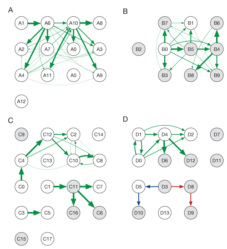
Figure 2—figure supplement 2. Ensemble transmission networks for wards A to D.

Figure 2—figure supplement 2.

Data were compiled over sets of plausible reconstructions, weighted by likelihood. The width of each arrow is proportional to the probability that a specific transmission event occurred. Arrows are shown for events with a 4% or greater probability of having occurred. Red and blue lines indicate mutually incompatible events; D3 could have infected D5 or D8, but the data precluded both of these occurring in the same reconstruction.
Figure 2—figure supplement 2—source data 1. Posterior probabilities of transmission between individuals on each ward.