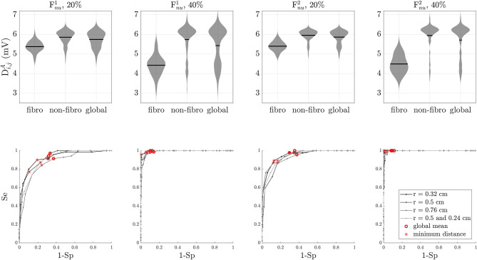
Figure 7.
Depolarization wave, Di,j(t) analysis. Top row: statistical distribution of depolarization wave amplitude in fibrotic areas, non-fibrotic areas, and the whole tissue for simulated cases with non-uniform diffuse type 1 and type 2 fibrosis at 20 and 40%. Black lines represent the mean of the distribution. Bottom line: ROC curves for the same simulated cases as in the top row. Optimal thresholds minimizing the Euclidean distance to the top-left corner of the graph are shown with asterisks. Red circles correspond to the mean of the depolarization wave amplitudes. In all cases, the optimal threshold Dth is lower than the global mean.

