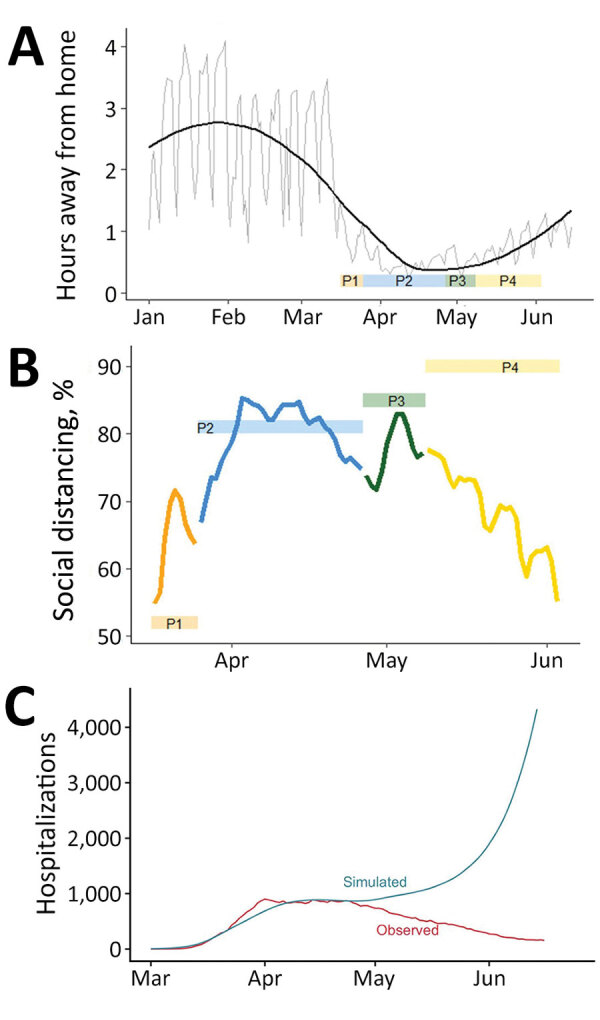
Figure 6.

Changes in population mobility before and after emergence of coronavirus disease, Colorado, USA, 2020, and comparison between mobility and estimated social distancing. A) Changes in mobility measured by the number hours spent away from home per day (source: SafeGraph, https://www.safegraph.com). Gray line indicates daily observations, and black line indicates a smoothed line using locally estimated scatterplot smoothing in R (https://www.r-project.org). The ribbon at the bottom indicates the 4 social distancing phases. B) Comparison between susceptible-exposed-infected-recovered model-estimated social distancing (colored boxes) and reduction in mobility relative to the preintervention period, January 29–February 15 (colored lines). Colors correspond to the 4 social distancing phases. Reductions in mobility are calculated as percentage decreases in time away from home relative to pre-epidemic baseline. C) Observed hospitalization data (red) and the simulated hospitalizations based on time away from home relative to a baseline mean during January 29–February 15. In the simulation, it is assumed there is no self-isolation of symptomatic infectious, no mask wearing, and no other transmission reduction to highlight the role of the mobility data in the simulation. P, phase.
