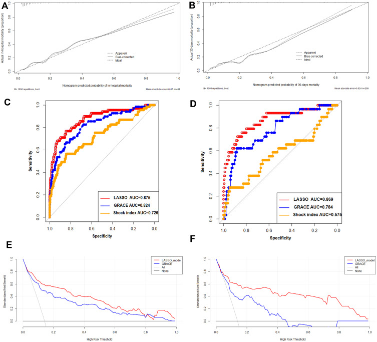
Figure 4.
Calibration plot of the nomogram in the training (A) and test cohorts (B). The dotted line represents the nomogram’s performance, whereas the solid line corrects any bias in the nomogram. The dashed line represents the reference line where an ideal nomogram would lie. Predictive accuracy of the LASSO model, GRACE model, shock index model for intrahospital mortality in the training (C) and test cohorts (D).Decision curve analysis of the nomogram in the training (E) and test cohorts (F). The x-axis indicates the threshold probability. The y-axis measures the net benefit. The gray line displays the net benefit of the strategy of treating all patients. The black line illustrates the net benefit of the strategy of treating no patients. The red line indicates the nomogram. Decision curve analysis is a specific method developed for evaluating the prognostic value of nomogram strategies. The net benefit of using a model to predict intrahospital mortality versus the strategies of “assuming all” or “assuming no” patients would be at high risk is shown for a different decision. The LASSO nomogram model (red) demonstrated an improved net benefit compared with the GRACE model.

