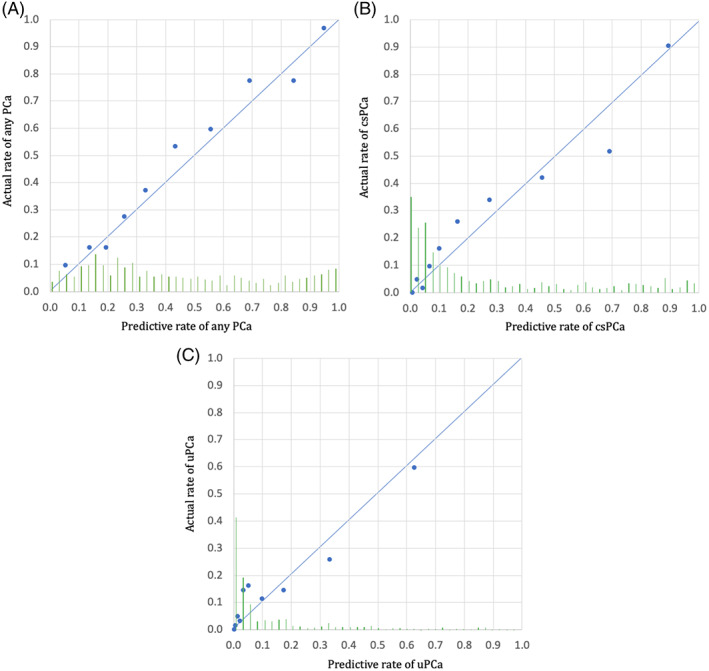
FIGURE 3.

A, Predictive probabilities of cancer for each case in the testing cohort are sorted by probability of PCa calculated from the training model, respectively. Each point (average of 60 subsequent cases) illustrates the comparison between predictive probability (calculated from the training model) and actual cancer rate for this group of cases. Points on the diagonal line (0, 0 and 1, 1), show the agreement between the predicted and actual rate of PCa and the validated training model. The histogram of the calculated probabilities for the validation cohort is shown along the horizontal axis. B, Predictive probabilities of cancer for each case in the testing cohort are sorted by probability of csPCa calculated from the training model, respectively. Each point (average of 60 subsequent cases) illustrates the comparison between predictive probability (calculated from the training model) and actual cancer rate for this group of cases. Points on the diagonal line (0, 0 and 1, 1) show the agreement between the predicted and actual rate of csPCa and the validated training model. The histogram of the calculated probabilities for the validation cohort is shown along the horizontal axis. C, Predictive probabilities of cancer for each case in the testing cohort are sorted by probability of uPCa calculated from the training model, respectively. Each point (average of 60 subsequent cases) illustrates the comparison between predictive probability (calculated from the training model) and actual cancer rate for this group of cases. Points on the diagonal line (0, 0 and 1, 1) show the agreement between the predicted and actual rate of uPCa and the validated training model. The histogram of the calculated probabilities for the validation cohort is shown along the horizontal axis
