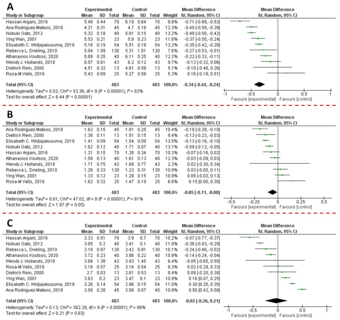
Figure 16.
Forest plot representation of the effects derived from the supplementation of PACs on total cholesterol (A), HDL (B), and LDL (C) levels. Data were extrapolated from [187,267,268,269,270,271,272,273,274,275], and plotted according to the mean difference. Each horizontal line of the plot represents an individual study, reporting the punctual result plotted as green box. The weight of each study is represented by the size of the green box. The horizontal line indicates the lower and upper limit of the 95% Confidence Interval (CI) of the effect observed for each study. The vertical line represents the no-effect. For each study, if the horizontal line crosses the vertical one, a statistically significant difference between Experimental and Control group is not observed. The black diamond at the bottom of the forest plot represents the average effect size combining together the results of all the selected studies. The horizontal points of the diamond are the limits of the 95% CI of the average value. The figure was generated by Review Manager Software, version 5.4.1.

