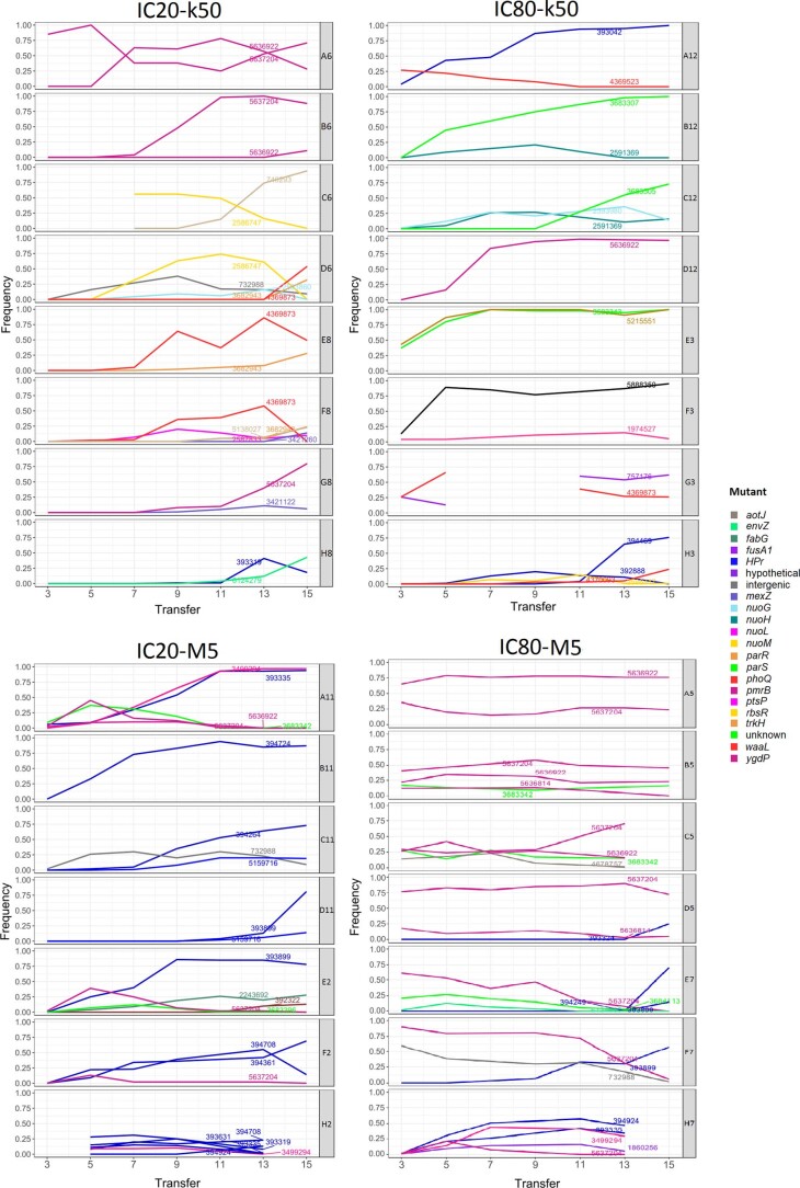
Extended Data Fig. 7. Allele dynamics of different treatment groups during the gentamicin evolution experiment.
Group names are given on top of the graphs. Population names are given in the boxes right of the graphs. The X-axes represent the transfer period. The Y-axes represent the relative frequency of alleles in a population. Colours refer to different genes that the mutations appear in (see legend on right). Line annotations refer to the position of the mutation in the PA14 genome.

