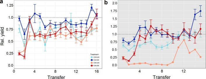
Extended Data Fig. 4. Evolutionary yield dynamics of the different treatment groups.
a, Gentamicin experiment, b, Ciprofloxacin experiment. X-axes represent the time series of the evolution experiment: every point represents the end of a growth period before the next transfer. The Y-axes represent the mean yield of the treatments based on the cell counts obtained from flow cytometry. Error bars represent standard error of mean (8 replicates, 1 in CIP-IC80-k50). Blue: IC20 treatments; Red: IC80 treatments; light colours represent k50 transfers; dark colours represent M5 transfers.

