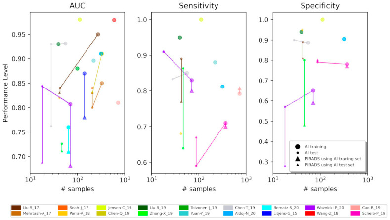
Figure 1.
Scatter plots showing the trends of the classification performance (AUC, Sensitivity, and Specificity) against the number of samples. When different models were implemented, the best results have been picked. The bigger symbols represent the performance achieved by training sets, while the smaller ones are by test sets. The round-shaped dots indicate the performance level obtained through AI models while the triangle-shaped dots by PI-RADS score. The two are linked by a bold line. Conversely, dotted lines connect performance evaluated with training and test sets obtained from the same AI model. Each color represents a specific study, as reported in the legend below the plots. In case this paper is read in html format, when a point is mouse hovered, a tip will pop up with the name of the paper, the dataset (training or test set), the number of samples, the performance (AUC, sensitivity or specificity value), the classification task, and the method description (AI model or PI-RADS) [see Table S1 if the html is not available].

