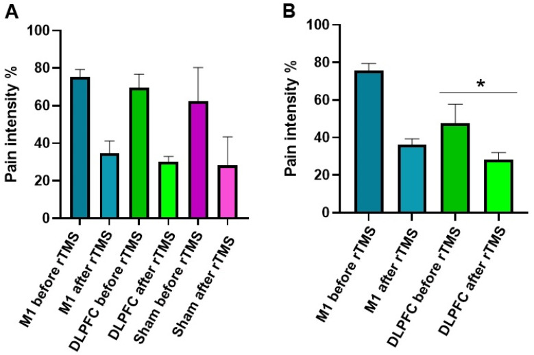
Figure 4.
rTMS effects on pain intensity between the groups on the 4th week (A) and 36th week (B). The y-axis indicates the mean pain intensity expressed as a percentage (%). The x-axis depicts the time points (in weeks) of conducted measurements. The * symbols indicate significant group differences (Bonferroni corrected, two-tailed, paired t-test, p ≤ 0.05). Error bars depict the standard error of mean (SEM).

